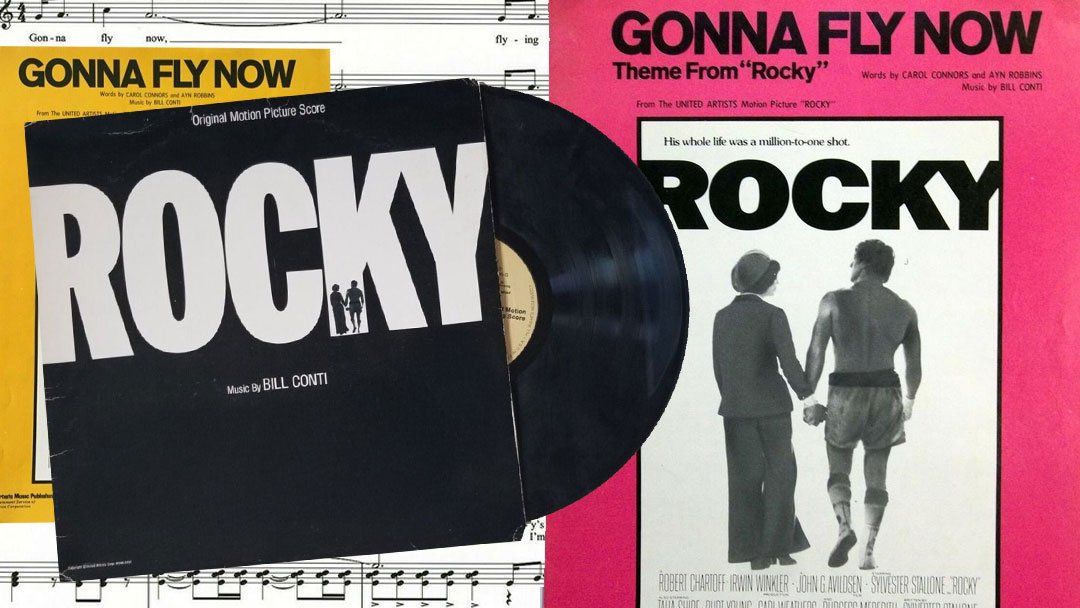
Before the world knew who Sylvester Stallone was, before Rocky became a box office phenomenon or an Oscar winner, there was this poster.
A stark black-and-white image—quiet, restrained, and unexpectedly intimate.
No flying punches or ringside chaos. Instead, it shows Rocky and Adrian walking away hand in hand, framed beneath the heavy weight of a bold, unadorned title: ROCKY. This wasn’t a poster trying to sell action. It was selling heart. And somehow, it told you everything without showing much at all.
A Designer’s Breakdown: Why This Poster Just Works
From a graphic design standpoint, the original Rocky poster is a masterclass in restraint. The choice to keep it black and white wasn’t just about budget—it was a creative decision that spoke to the world Rocky was born into. A Philadelphia that was gray, gritty, and worn. A world where hope stood out because everything else felt faded.
The towering, thick sans-serif font planted firmly at the top tells you: this is not a flashy story. This is a grounded one. The figures of Rocky and Adrian aren’t facing the camera. There are no clenched fists or bloody gloves. What you get is intimacy. Connection. Humanity.
The placement of Rocky on the right—shirtless, battered, and bruised—balances perfectly with Adrian on the left, fully clothed, composed, and emotionally present. Her silhouette matches his, and their clasped hands form the centerpiece of the entire composition.
It’s a visual metaphor for the heart of the film: Rocky may be the body, but Adrian is the soul.
And it’s no coincidence. Stallone has said many times: Adrian is the heart of Rocky. Without her, the story collapses. It becomes just another tale of a washed-up fighter trying to land a payday. But because of her, it becomes a film about worth, dignity, and love. She’s not a side character here—she’s given equal billing in the image, literally sharing center stage on the most important marketing piece of the entire franchise.
This is the only poster in the Rocky series that features Adrian so prominently. That alone makes it stand out.
Who Designed the Poster? The Mystery Artist Still Unnamed
As of this writing, it is not confirmed who designed the final one-sheet poster for Rocky (1976). The theatrical release version—black and white, minimalist, emotionally loaded—carries no artist credit. There’s no known documentation from United Artists identifying who created it. It’s one of the most recognizable images in film history, and yet its designer remains anonymous.
It’s possible the artwork came from within UA’s in-house marketing department. Or perhaps it was outsourced to a freelance illustrator under tight deadline. But at this point, no one knows for sure.
Tom Jung and the First Known Rocky Poster Art
However, there is one name worth seriously considering: Tom Jung.
While no one has confirmed that Jung designed the final theatrical poster, he did create one of the very first concept illustrations for Rocky—and it stands as the earliest known piece of visual promotional art for the film.
That drawing, executed in graphite on paper, is a striking narrative collage. A young Rocky stands at center, arms on hips in a worn robe, with various vignettes from the movie orbiting him. There’s Adrian, set off in her coat. Mickey grimacing. The faces of South Philly’s tough crowd, the streets, and Rocky sitting in his corner of the ring. It’s raw, and loaded with character detail.
Stallone himself confirmed the piece’s significance, stating: “Very very very rare! Believe it or not this was the first poster ever made for the first ROCKY… Hand drawn! This is the ONLY one in existence!!!! No one but me has seen this in 42 years! The artist is the incredible TOM JUNG.”
Stallone later sold the artwork at Julien’s Auctions in 2021, where it fetched $10,240 from his personal archive. While we can’t confirm whether Jung worked on the final one-sheet, his concept art does carry the distinction of being the first Rocky poster ever created.
Given his track record, Jung’s involvement remains entirely plausible. He worked extensively with United Artists, MGM, Columbia, and Lucasfilm. His portfolio includes the 1967 re-release of Gone with the Wind and the legendary Star Wars “Style A” poster, which shows Luke Skywalker’s saber forming a cross of light against Darth Vader’s looming silhouette—a visual solution Jung crafted to echo the theme of “good versus evil.”
Ultimately, while we’re not claiming that Tom Jung designed the final one-sheet, his early contribution to the film’s visual identity is undeniable—and his name deserves a place in the conversation.
The Image Comes From a Lost Ending
Most fans don’t realize this: the poster photo isn’t staged. It comes straight from a deleted scene. In Rocky’s original ending, after the fight, Rocky and Adrian walk out of the Spectrum alone. The crowd has cleared out. The lights hang low. It’s just the two of them, slipping away into the quiet.
In the original photo, Rocky is holding a small American flag—a nod to the film’s 1976 bicentennial setting. Adrian is wearing her red beret and the same outfit seen in the final scene.
This was a moment of dignity, not victory—and it became the face of the film. A deliberate choice that says everything about what Stallone and director John Avildsen were aiming for.
Alternate Poster Designs
After Rocky won Best Picture at the 1977 Oscars, a new version of the poster emerged. This one dropped the emotional subtlety and went full victory lap. Gone was Adrian. In her place: Stallone with his fists in the air, basking in the glory of the final bell.
The Oscar poster leans into triumph. It’s louder, more traditional, and far more commercial. It worked—but it didn’t have the same soul.
International posters for Rocky varied widely. Some focused on training montages. Others leaned into the boxing. A few tried abstract art. But none captured the emotional heartbeat of the story quite like the original U.S. release.
What’s It Worth? A Collector’s Look at the Original One Sheet
The original Rocky one sheet—printed in late 1976 with a 1977 copyright in the lower margin—is what serious collectors are after. These are standard U.S. theatrical posters measuring 27 x 41 inches, printed on relatively thin stock and always folded at the time of distribution. Rolled versions didn’t exist for this release.
Most surviving examples include standard vertical and horizontal fold lines. That’s not damage—that’s how studios shipped posters to theaters. Collectors prioritize clean corners, strong color, and minimal wear along the folds.
An easy way to identify a first-issue print is by checking the date. Although the film premiered in late 1976, the original poster shows “1977” in small print along the bottom border. If that date’s there and the folds look right, chances are you’ve got the real deal.
Here’s what you’re looking at in terms of value:
- High-end folded original: $750 if it’s sharp, clean, and well-preserved
- Mid-range collector copy: $100–$300 for a solid version with standard wear
- Beat-up copy: Even posters in rough shape—faded, creased, or torn—can still fetch $20 bucks
In addition to originals, there are also autographed reproductions. While these don’t carry the same collector value, they appeal to fans in a different way. For example, one reproduction signed by Stallone, Talia Shire, Burt Young, and Carl Weathers sold at auction for $1,625 in 2022—not bad for something that never hung in a theater.
So whether you’re a poster purist hunting for original folds or a fan chasing ink from the cast, there’s a version of this iconic design out there that fits.
Where to Find One
Originals still pop up from time to time on eBay or through specialty auction houses. However, if you’re not ready to throw down for a collector-grade copy, you can also grab a reproduction of the original Rocky poster.
Either way, this image belongs on the wall of any serious Rocky fan.


